HISTOGRAM, Meaning of histogram, Histogram is a graphical representation of frequency distribution. It is made up of a set of rectangles that have their bases on the horizontal axis, i.e. X – axis, and their frequency on the vertical axis, Y – axis. They also have their rectangles at the centre on the class mark (i.e midpoint) of each interval.
HOW TO DRAW A HISTOGRAM
The areas of the rectangles are proportional to the class frequencies. In drawing a histogram, there is no gap or space between two bars, unlike the bar chart.
Drawing a histogram involves a series of steps to represent data in a bar graph format. Here’s a general guide on how to draw a histogram:
Gather your data: Collect the data you want to represent in your histogram. Make sure the data is organized and numeric, such as a set of measurements or values.
Determine the number of bins: Decide on the number of bins (or intervals) you want to divide your data into. The number of bins will depend on the range and distribution of your data. A common rule of thumb is to have between 5 to 15 bins, but you can adjust this based on your data and preferences.
Calculate bin widths: Divide the range of your data by the number of bins to determine the width of each bin. This ensures that each bin represents a specific range of values. Bin width = (Max value – Min value) / Number of bins.
Create a horizontal axis: Draw a horizontal line and label it with the variable or data category you are representing. For example, if you are plotting heights, you might label it as “Height (in inches).”
Create a vertical axis: Draw a vertical line perpendicular to the horizontal axis, indicating the frequency or count of data values falling within each bin. Label the vertical axis accordingly, such as “Frequency” or “Count.”
Mark the scales: Add appropriate scale values to both the horizontal and vertical axes. The scale on the horizontal axis should represent the ranges of your data, and the scale on the vertical axis should represent the frequency or count values.
Draw the bars: For each bin, draw a vertical rectangle or bar above the corresponding value on the horizontal axis. The height of each bar represents the frequency or count of data values falling within that bin.
Space the bars: Leave some space between adjacent bars to visually distinguish each bin. The width of each bar should correspond to the calculated bin width from Step 3.
Label the bars: Optionally, you can add labels above or within each bar to indicate the specific frequency or count value for that bin.
Add a title and additional labels: Include a title for your histogram, such as “Distribution of Heights,” and any additional labels or information that provide context or insights about the data.
EXAMPLE OF THE USE OF HISTOGRAM
A farmer harvested 60 tubers of yam for eight days. The number of yam harvested per day is shown in table 2.9. Draw a diagram to represent the information.
Table 2.9: Number of tubers of yam harvested in a farm.
HISTOGRAMS Meaning of histogram, Histogram is a graphical rep distribution. set of rectangles that have their bases on the horizontal axis,,
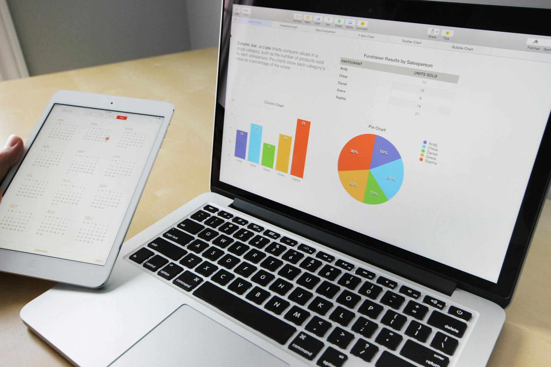
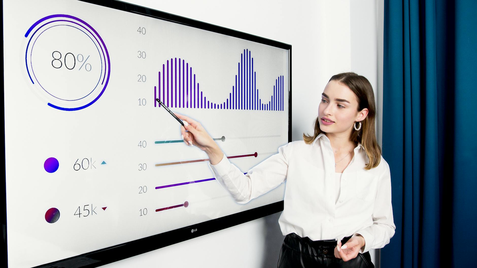
A histogram is a graphical representation that organizes a group of data points into user-specified ranges. Similar in appearance to a bar graph, the histogram condenses a data series into an easily interpreted visual by taking many data points and grouping them into logical ranges, visual representation of data distribution.
Furthermore, histograms facilitate in the display a massive amount of data along with the frequency of the data values. Moreover, one can determine the median and distribution of the data by making use of a histogramd
HISTOGRAMS
market concept
how companies raises funds for expansion
WEED AND THEIR BOTANICAL NAMES
Here are 15 FAQs related to histograms:
Q: What is a histogram?
A: A histogram is a graphical representation of the distribution of a set of data, typically using bars to represent the frequency or density of data points within a range.
Q: What is the purpose of a histogram?
A: The purpose of a histogram is to visualize and understand the distribution of data, including its shape, central tendency, and variability.
Q: How do I create a histogram?
A: To create a histogram, you need to determine the range of values, divide the range into bins or intervals, count the number of data points in each bin, and plot the frequency or density of each bin.
Q: What is the difference between a histogram and a bar chart?
A: A histogram is used to represent continuous data, while a bar chart is used to represent categorical data.
Q: How do I choose the number of bins for a histogram?
A: The number of bins depends on the data and the purpose of the histogram. A common rule of thumb is to use between 5 and 15 bins.
Q: What is the difference between frequency and density in a histogram?
A: Frequency refers to the number of data points in each bin, while density refers to the proportion of data points in each bin relative to the total.
Q: Can I use histograms for categorical data?
A: No, histograms are typically used for continuous data. For categorical data, bar charts or pie charts are more suitable.
Q: How do I interpret a histogram?
A: When interpreting a histogram, look for the shape of the distribution (e.g., normal, skewed), the central tendency (e.g., mean, median), and the variability (e.g., range, standard deviation).
Q: What is a skewed histogram?
A: A skewed histogram is one where the data is not symmetric, and the majority of the data points are concentrated on one side of the distribution.
Q: How do I identify outliers in a histogram?
A: Outliers can be identified as data points that are far away from the rest of the data, often appearing as isolated bars or points on the histogram.
Q: Can I use histograms to compare two datasets?
A: Yes, you can use histograms to compare two datasets by creating side-by-side histograms or overlaying the histograms.
Q: What is the relationship between histograms and probability distributions?
A: Histograms can be used to approximate probability distributions, and the shape of the histogram can give insight into the underlying distribution of the data.
Q: How do I create a histogram in Excel?
A: In Excel, you can create a histogram using the Analysis ToolPak or by using the built-in histogram chart type.
Q: Can I customize the appearance of a histogram?
A: Yes, you can customize the appearance of a histogram by changing the colors, fonts, and layout.
Q: What are some common applications of histograms?
A: Histograms are commonly used in statistics, data analysis, and quality control to visualize and understand the distribution of data.
Originally posted 2025-07-31 13:23:34.